- Portfolio
-
Services
Product DevelopmentFocus on the core idea and market fit while we masterfully handle user-focused product design.Learn moreEngineeringLeverage cutting-edge technology to address customer challenges with expert guidance.Learn moreAI consultingEmbrace the future of AI-driven innovation and thrive in a rapidly evolving digital landscape.Learn moreGrowth MarketingEngage targeted audiences and meet business goals through strategic marketing solutions.Learn more
- Company
- Insights
-
Areas of expertiseProduct DevelopmentFocus on the core idea and market fit while we masterfully handle user-focused product design.EngineeringLeverage cutting-edge technology to address customer challenges with expert guidance.AI consultingEmbrace the future of AI-driven innovation and thrive in a rapidly evolving digital landscape.Growth MarketingEngage targeted audiences and meet business goals through strategic marketing solutions.
How to Make a Website Accessible
- The importance of an accessible website
- How to check a website’s accessibility
- Benefits of website accessibility
More than 60 million Americans have either hearing or visual troubles. Assistive technologies can help them use the web. Web accessibility is also important for users with a temporary impairment. If you sell products or offer services on the web, we offer the following crucial reasons why you should make your website accessible and tips on how to design, code, and present content for people with disabilities.

The importance of an accessible website
Creating and maintaining an accessible website is advantageous for every site visitor, not just those with permanent disabilities. For example, if your mouse is broken, you need to be able to order a new device using only a keyboard. Or, if your arm is injured, a screen reader will allow you to continue browsing. Thus, assistive technologies can be beneficial for all users. However, websites and applications must be built properly from the onset for these technologies to work effectively.
According to the experts at the W3C Web Accessibility Initiative (WAI), web accessibility also helps mobile users and older users, by optimizing site content for search engines to index. The WAI brings together people from industry, disability organizations, government, and research labs from around the world.
The WAI has developed a series of accessibility standards and guidelines. Web Accessibility Content Guidelines were first published in 1999, and the second edition appeared in 2008. These guidelines are intended to make content accessible to a wider range of people with disabilities, including blindness and low vision, deafness and hearing loss, limited movement, speech disabilities, etc.

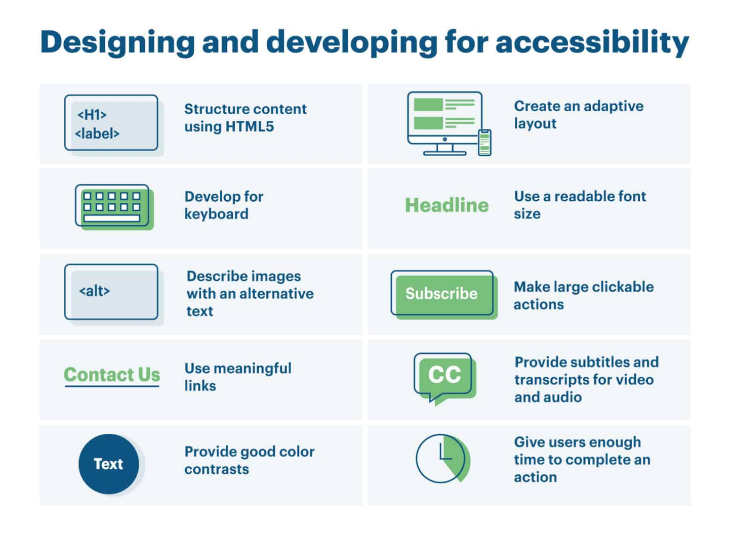
Ensuring web accessibility requires proper coding, the creation of accessible design, and optimization of the site content. Common standards of web accessibility include several specific points. Images and animations should contain an alternative text (the alt attribute). Multimedia is supposed to have an alternative format (captioning and transcripts of audio, descriptions of video). Hypertext links need descriptive text that makes sense (avoid “Click Here”). Proper page organization (headings, lists, and a consistent structure) and sufficient contrast between text and background are crucial.
The Web Accessibility Initiative provides more tips for developing a user interface, visual design, coding, and writing content for the disabled. We have illustrated some of the requirements with different pieces of code – inaccessible and accessible.
1. Structure content using HTML5. For example, use the navigation section element <nav> to help users of screen readers.
A screen reader understands the next code as “Link, Home”.
<div class="menu">
    <a href="https://www...">Home</a>
    <a href="https://www...">Projects</a>
    <a href="https://www...">Contact</a>
</div>
A screen reader understands the next code as “Navigation. A list, the first of three. Link, Home”.
<nav>
    <ul>
        <li><a href="https://www...">Home</a></li>
        <li><a href="https://www...">Projects</a></li>
        <li><a href="https://www...">Contact</a></li>
    </ul>
</nav>
2. Provide accessible and more efficient navigation marking up headings with <h1> … <h6>.
Inaccessible coding:
<p><h1>The title of the page</h1></p>
<p><strong><font size="5">The first section</font></strong></p>
<p><strong>The sub-section</strong></p>
<p><strong><font size="5">The second section</font></strong></p>
<p><strong>The second sub-section</strong></p>
Accessible coding:
<p><h1>The title of the page</h1></p>
<p><h2>The first section</h2></p>
<p><h3>The sub-section</h3></p>
<p><h2>The second section<h2></p>
<p><h3>The second sub-section<h3></p>
3. Describe images with an alternative text and provide transcripts for video and audio. The alt attribute should be informative. Compare:
<p><img src="phone.png" alt="picture-10"> 0123 456 7890</p>
<p><img src="phone.png" alt="telephone"> 0123 456 7890</p>
4. Group related elements in a form using the <fieldset> tag that adapts your code to the user’s technology.
A screen reader understands the next code as “Black is chosen. Radio button. The first of two”.
<input type="radio" name="color" id="white" checked>
<label for="white">White</label>
<input type="radio" name="color" id="black">
<label for="black">Black</label>
A screen reader understands the next code as “Black is chosen. Radio button. The first of two”.
<fieldset>
    <legend>Color of the mouse</legend>
    <input type="radio" name="color" id="white" checked>
    <label for="white">White</label>
    <input type="radio" name="color" id="black">
    <label for="black">Black</label>
</fieldset>
5. Use meaningful links that describe the content of the link target. Avoid uninformative and ambiguous text, such as “click here” or “read more”.
Inaccessible example:
<p>To download the plugin, <a href="https://wordpress.org">click here.</a><p>
Accessible example:
<p>Download the plugin from the <a href="https://wordpress.org">official WordPress directory.</a></p>
6. Consider the contrast between text and background to make a user interface accessible. Readable font size is important too.

7. Develop for keyboard use only to let users of screen readers navigate your website.


The web developers at Dizzain say that it’s easier to build websites and applications according to the accessibility standards from the very beginning than to try to modify existing sites or apps. Since the beginning of 2018, all of the new websites we have started to work on have been coded according to the WAI guidelines. We can also make improvements to accessibility as separate projects for those who need it. Just contact us.
How to check a website’s accessibility
While you may not be a web developer, you might be a website owner or a regular site visitor who knows a little about alt attributes, div tags, CSS for layouts, etc. You can check a website for accessibility. Try to navigate the site using only a keyboard. Does it work? Download a screen reader such as VoiceOver, NVDA, or JAWS, and test whether potential visitors with little or no vision could browse the website.
Special tools can also be used to check website accessibility. For example, Lighthouse is an open-source, automated tool for improving the quality of web pages. For a deeper and more professional inspection, use Pa11y, accessibilityjs, Tenon.io, or other accessibility testing tools.
Benefits of website accessibility
Website accessibility offers commercial, ethical, and other benefits.
First, web accessibility leads to an increase in the number of potential and actual customers. According to data from the CDC, almost one-in-six American adults have hearing troubles and almost one-in-ten adults have vision troubles. All of these people are potential customers for your goods or services.
Second, you strengthen your brand identity. An accessible website is an opportunity to enhance your company’s public image.
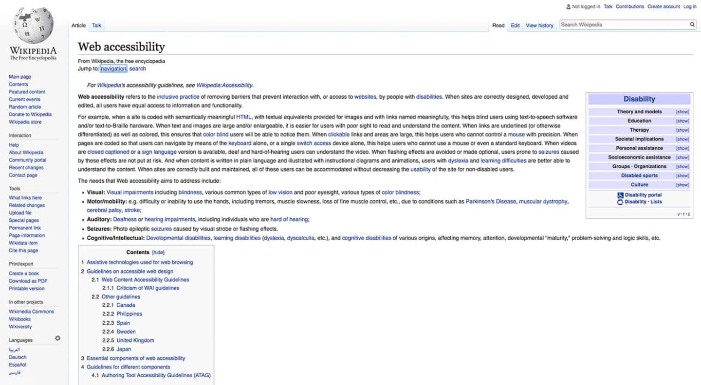
Finally, web accessibility is important for providing equal access and equal opportunity to people with disabilities and letting them more actively participate in society. World-famous brands such as Wikipedia and Google embrace web accessibility. On the other hand, some companies have been sued because their websites offer poor accessibility.
If you want to develop an accessible website or make an existing website more accessible, please feel free to contact us. Our specialists will provide you with a free consultation.


